Objective
Design a poster to promote a free local screening of the movie Helvetica by Gary Hustwit.
Use ‘Helvetica’ as the main heading of the poster.
Create interest and engagement using hierarchy, emphasis, contrast, balance and composition. Experiment as much as you can with the typography to create a creative design and layout. Experiment with size, angles, boldness, contrast, shade, positive and negative space.
Process
For my poster I wanted to design something cool but not hard to read or too overwhelming. I originally had designed it as a Swiss Army Knife since Helvetica is a swiss font, but I realized that the type would be too hard to read. I was then inspired by a poster I saw and thought having the letters hanging and having an inner shadow would be cool. I chose red and white because those are the colours of the Swiss flag and the typography is Helvetica.
Medium/tools used
Indesign, Illustrator
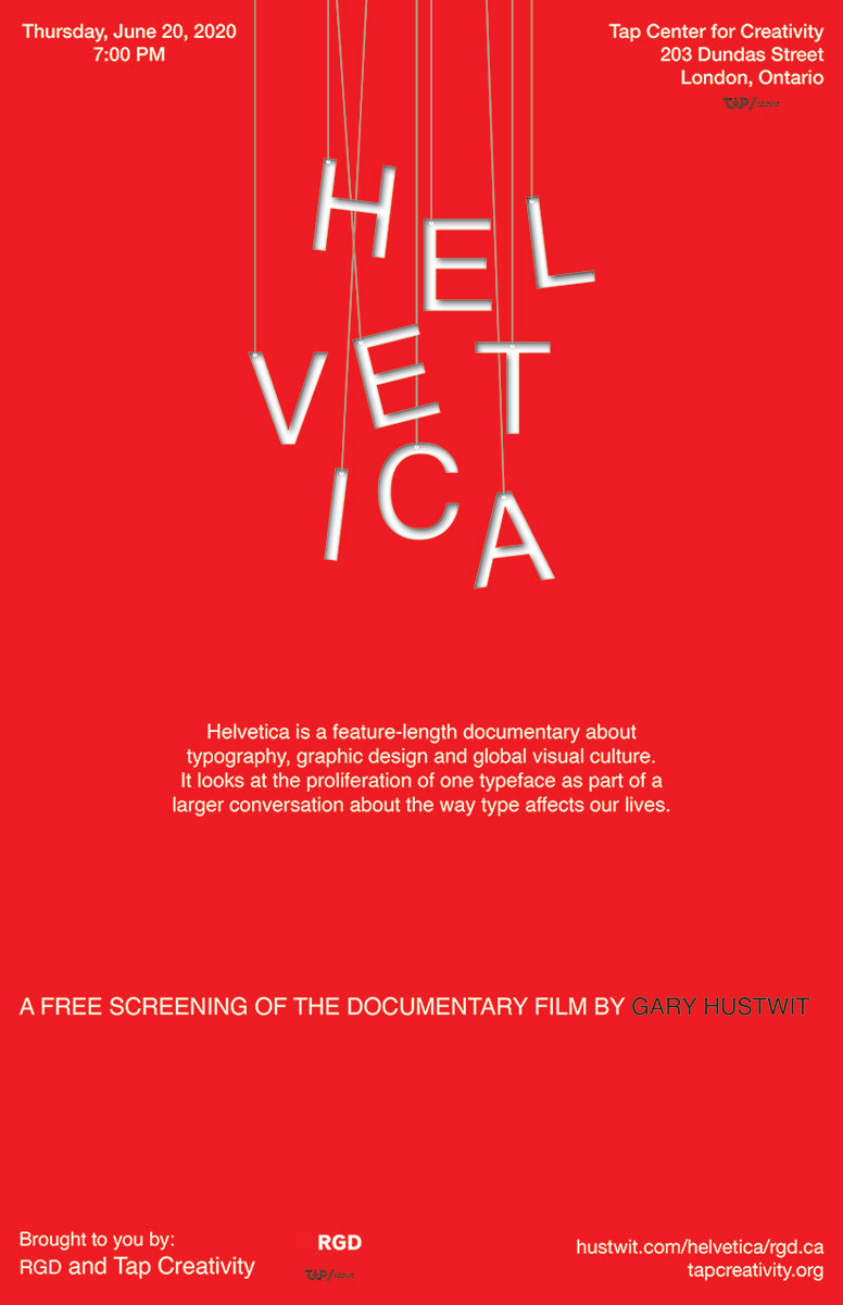
Final poster design
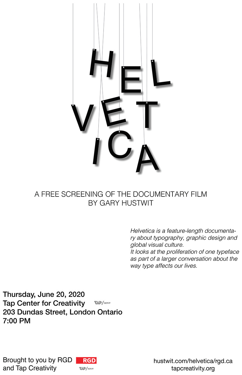
Concept 1
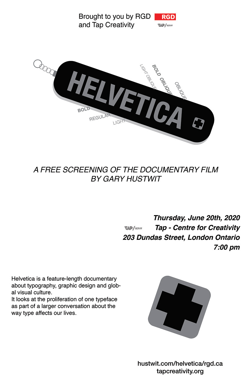
Concept 2