
Objective
To create a poster for our favourite band to perform at a fictitious Covid-19 benefit concert.
Process
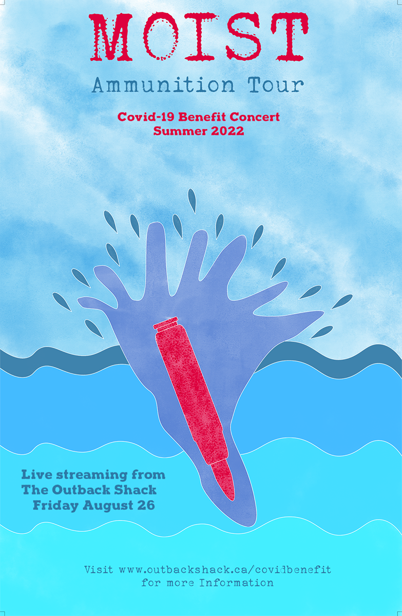
My favourite band is Moist, so I chose to base my tour after my favourite new song from the band. I decided on the bullet going into water over the others because it is ammunition and the water signifies the band.
I chose the blue colours because they represent water, and the red because it went well.
The typography I chose was a water type font and it kind of looks like old font they have used.
Medium/tools used
Indesign, Illustrator
Final poster design
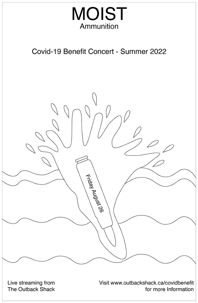
Linear design of poster
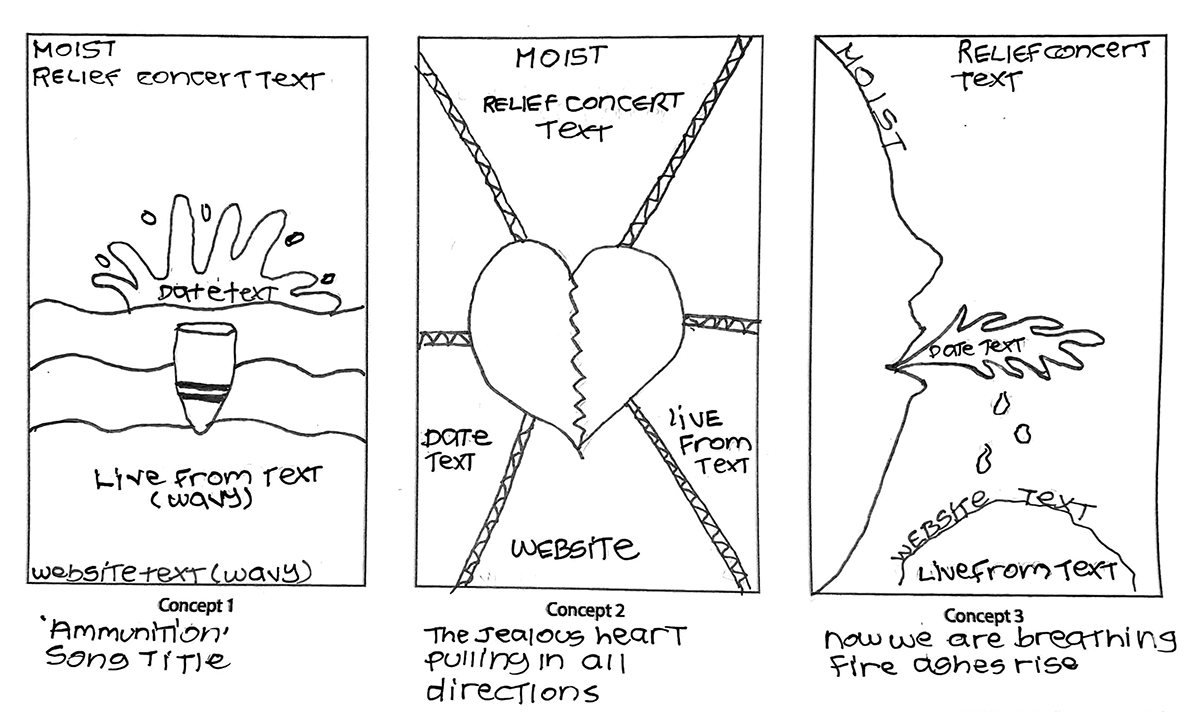
Thumbnails for poster design